Edward Hospital
Campaign
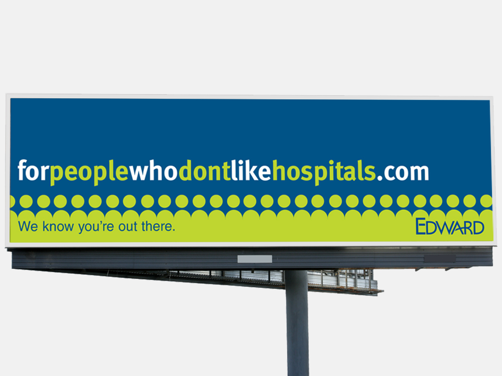
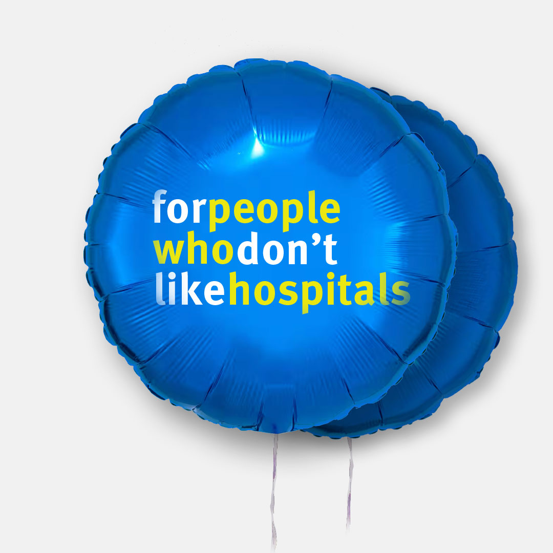
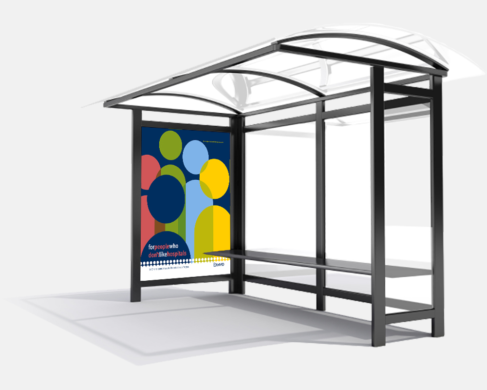
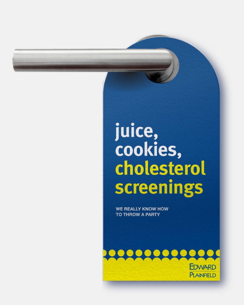
I worked with a longstanding hospital client on their concept development and brand refresh. Their focus was on improving the patient experience. We aimed to transform the common negative emotions associated with healthcare into a positive, uplifting message. Following this, I created campaign materials that extended across web, social, OOH, and print channels.